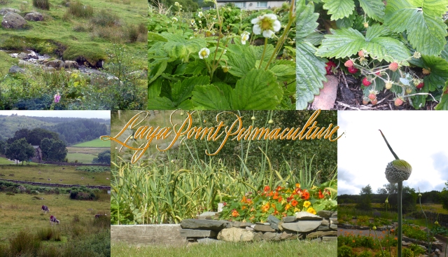
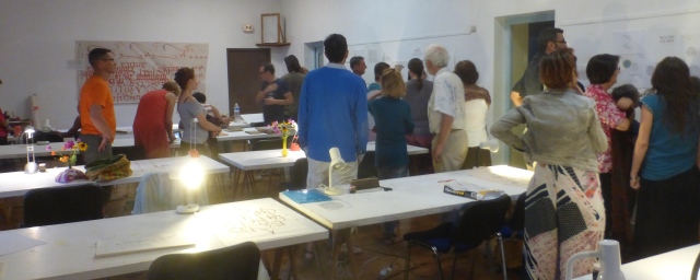
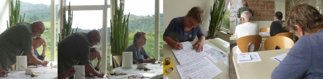
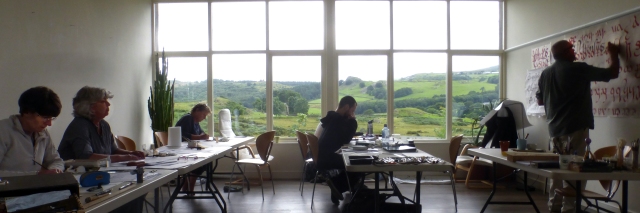
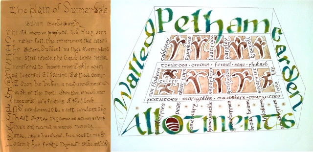
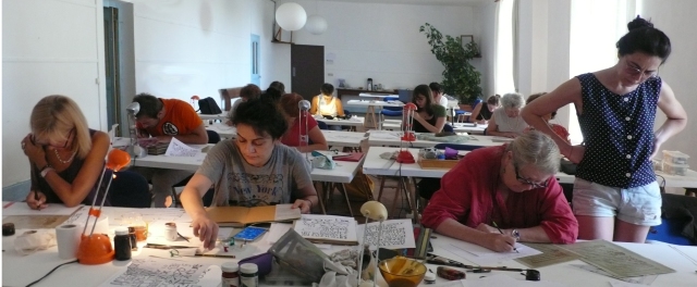
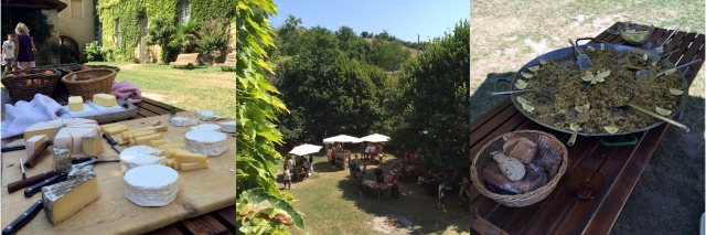
 Laya Point Permaculture is a richly beautiful smallholding in the English Lake District, a region celebrated for its luscious views, romantic landscapes and (surprise!) lakes. This summer for the first time we succumbed to the blandishments of Keith’s godson Tom Dennison, who is the guiding genius of Laya Point (along with Nicole Hermes [“Lala”] his right-hand woman executive and communer with vegetables) and rolled on North to offer a course of Catalan Carolingian Calligraphy in a space we had never seen. Now we have. The much-fêted Salle Blanche of Saint-Antoine-l’Abbaye may now see some competition for the title of Best Classroom in Europe for the Teaching of Calligraphy. You will have to experience both in order to judge. These windows in The Old School at Ulpha: Laya Point’s main classroom/meeting space, might’ve been made for a modern scriptorium.
 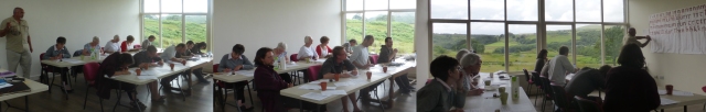 Head gardener & chef Lala prepared delicious lunches for us every day, and we were required to pick and eat as many strawberries as we possibly could. They wanted eating.
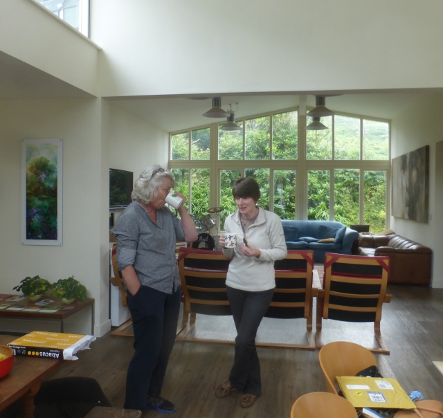
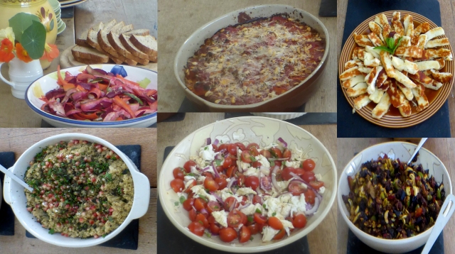
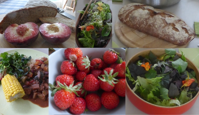 The full range of dedicated calligraphers…
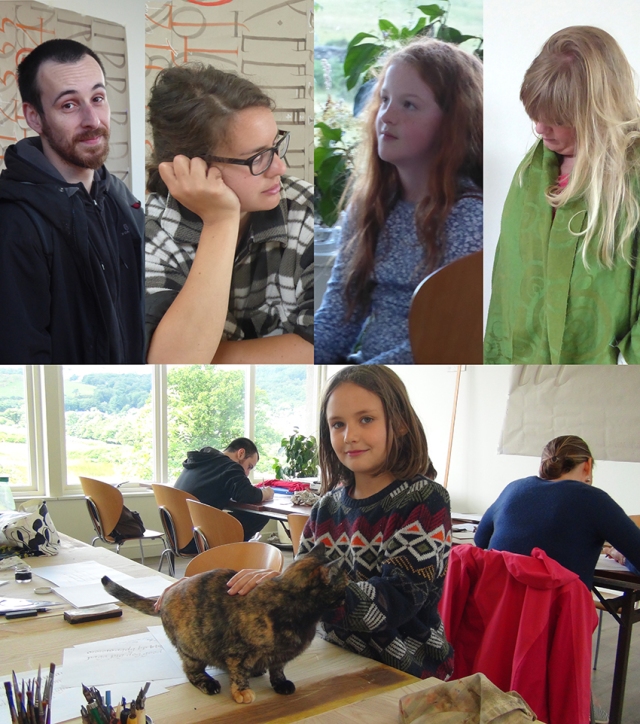
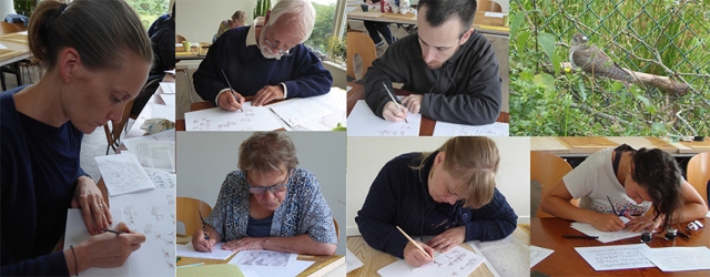
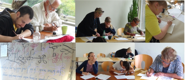
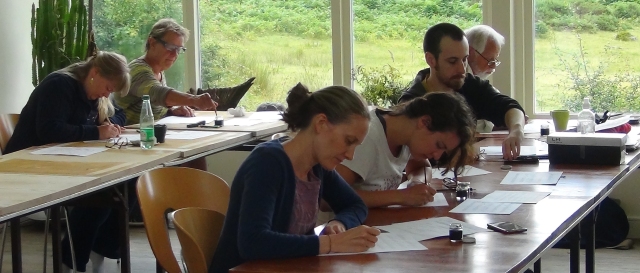
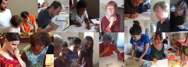
 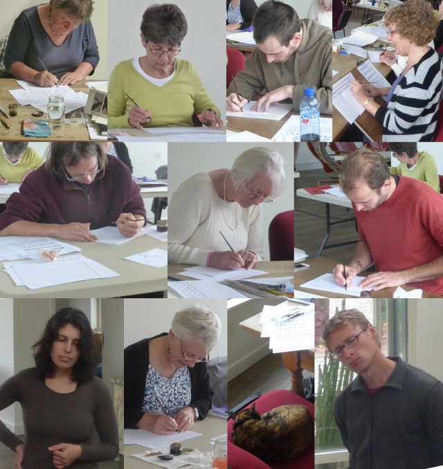 Liz Goyder, Susan McGahan, Miquel Centellas, Lillian Berry, Stephen Watts, Helen Cowan, Tom, Nicole, Mabel Little, Mia (who really did no calligraphy, but helped to keep us all cheerful), and Steffen Hirth, Laya Point’s Wwoofer (en route to University at Manchester). Mabel and Helen were lured to Laya Point, I believe, through their membership in Eden Valley Scribes.
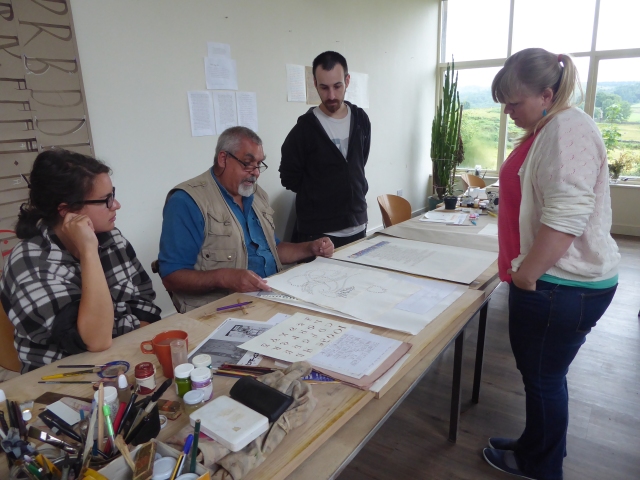
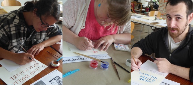
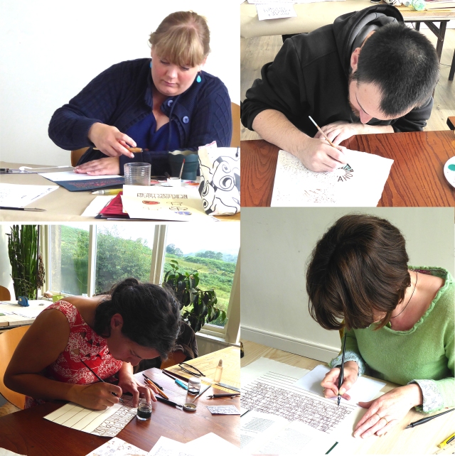
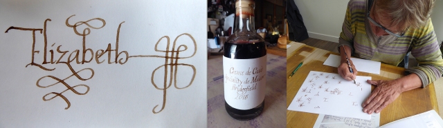
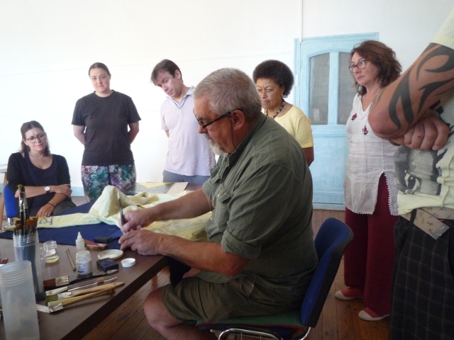
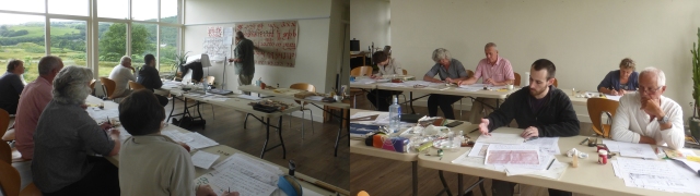
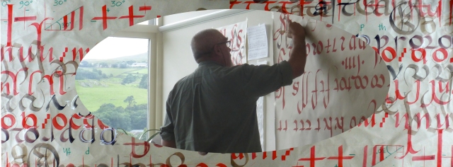
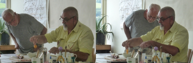
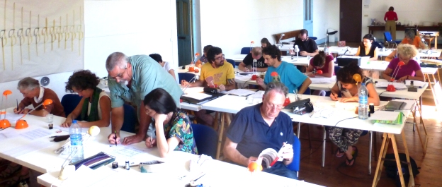
  Sue, Miquel, Lillian, Lala and Liz surround Keith’s first day demonstration…days later, Mabel, Liz, Helen Miquel & Tom following my demonstration of various uses of pigments, ground on glass with a glass muller…assorted media–gum arabic, almond gum, egg, glair… Which paint (gouache? watercolour?) for which work, and so on ad infinitem. Or at least until they began to distract me with questions for a little break…and the fabled duck-egg glair, which took, I think, actually half an hour to beat with all of us sharing. Cennino Cennini never mentions duck eggs. Quill cutting was a major activity, but as I was doing it, I have no photos. Mabel? did you take many? Anyone? And of your beautiful machine? Also, more photos of Keith actually presenting the script on the non-blackboard?
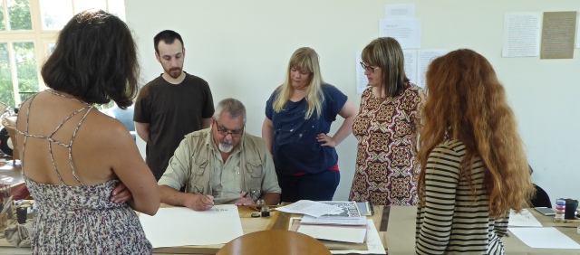
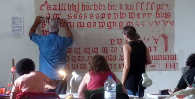
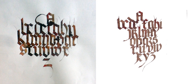
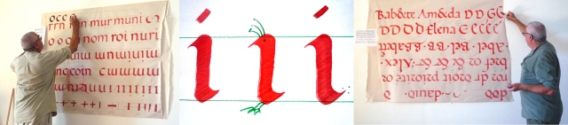
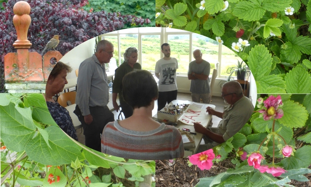
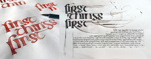
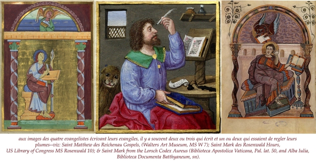
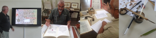 Keith shows us images of manuscripts from Eleventh Century Girona…a facsimile of one of his own manuscript books (this one on paper) with some pages in a modern Catalan Carolingian…& demonstrates aspects of these Catalan scripts.
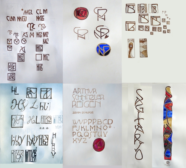
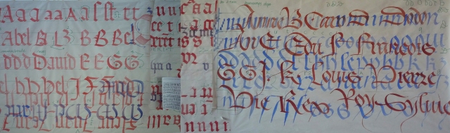
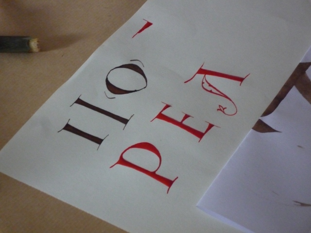
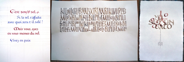
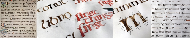
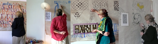
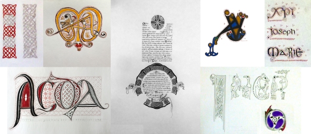
We had a look at the possibilities of adapting some of the historical initials–especially the droll zoomorphic, or at least zoocephalous initials accompanying the Catalan carolingian… 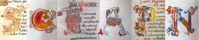 Applied, with modifications and additions…along with other historical and modern possibilities–some adaptations by Sue, Lillian, Mabel, Helen & Tom:
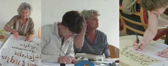
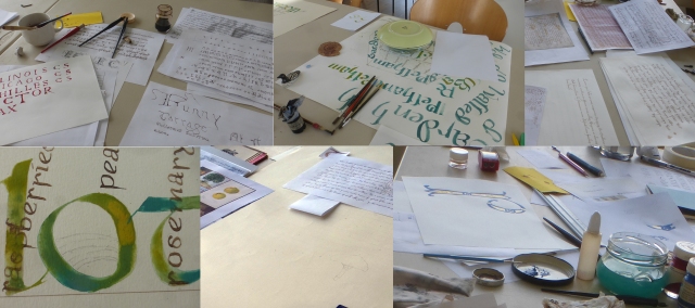
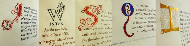 Everyone had a chance to write on calfskin vellum with a quill and ferro-gallic ink and/or gouache pigment & duck-egg yolk or duck-egg glair, some people added a little shell gold. Some people wrote on both sides of the skin. (Have you any photos of the inked sides? I haven’t. I’d like to include some, please!)
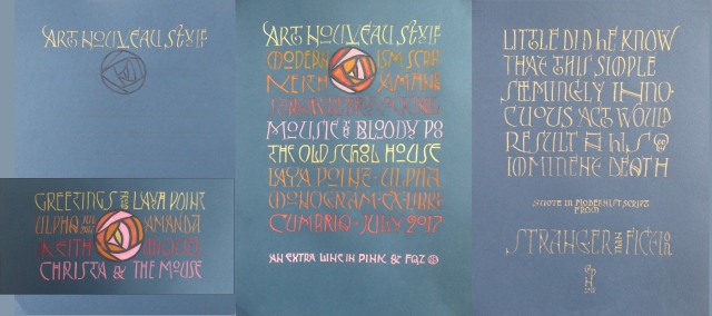
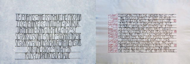
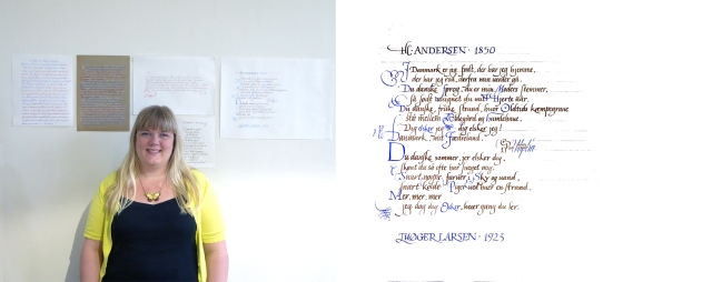
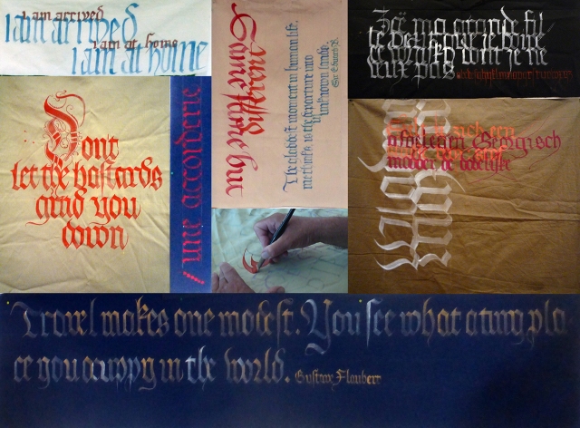
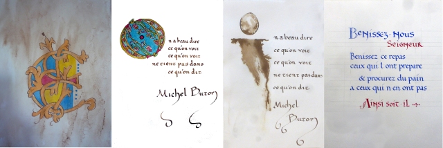
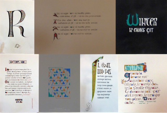
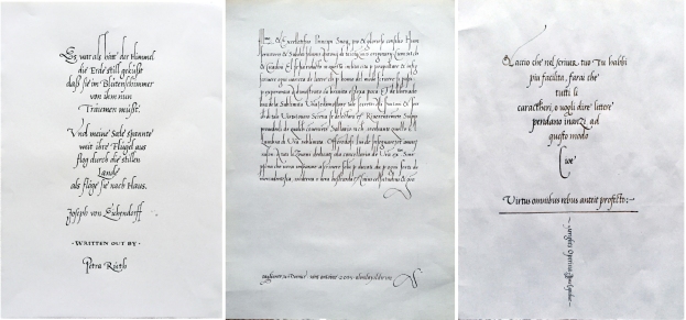
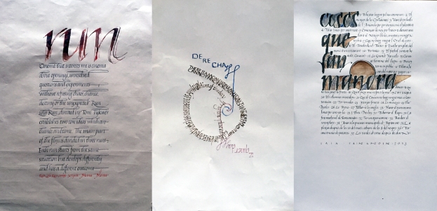
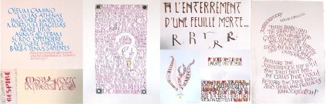
  Now my memory is failing me–the spiral text is Tom’s; “JOY” is Stephen’s; the Jeff Stone text is Lillian’s; I think (but you’ll correct me, won’t you?) that “When you know Nature…” is Mabel’s; that “power dwells apart…” is Sue’s; and that the Lao Tzu text is Helen’s. But I could be very mistaken. Apologies if I am wrong. That was the minuscule (but not in a paleographic sense) part of the end-of-course exhibition. Then along the wall, we have:
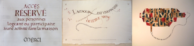
 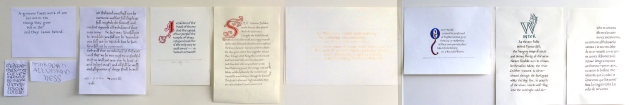 Some drafts of Stephen’s, Liz’s draft, projects by Sue, Mabel, Stephen, Helen, Lillian & Miquel. What about a closer look? Might the finished version from Liz’s draft look like this?
  Sue’s “Jerusalem” quotation looks clean and dignified with it’s long “J/I” in classic vermillion. Perhaps we were rather classic, all of us, but even six days to cover the basics of an historical script and its accompanying decoration along with appropriate tools and materials, and few excursions into modern calligraphic play (beer-tin pens!) takes time.
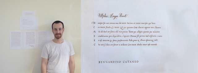
 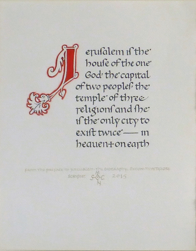 A very elegant colophon and signature.
But look: Weeks later, Sue has continued working on the theme, and come up with a stunning new version:
 Mabel:
If anyone has photos in better focus, I will happily replace mine! But we get the idea of Mabel’s presentation Wordsworth’s The River Duddon, as we were on the River Duddon… And she cleverly included the attribution, colophon and signature inside the initial. (I’d love an in-focus shot of that–presumably you still have it, Mabel, might you photograph it for us, please?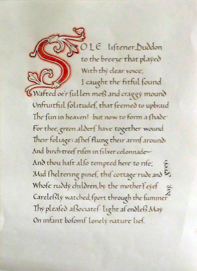
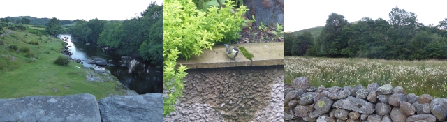
 This little rill, right outside our panoramic window, runs into the Duddon only metres down the hill. Mabel was inspired! {Sorry, yes. It’s England: “…only yards down the hill.”}
  One of Stephen’s versions, I think with an ink from Jack C. Thompson, made with Catalan ilex galls we sent him. A paler, almost golden colour, that will nonetheless darken eventually. Stephen’s attribution and signature combined in a roundel…anyone have a better photo? This question is understood to be constantly repeated, for each work exhibited, please! And when we saw it on the wall, this version lacked it’s initial. Stephen stayed late and kept working: Here’s another version:
  “Quiet minds…”, characteristically Scots, perhaps (?) from Helen, the red and blue not as clearly separate in the photo as “IRL”. I wish I had a photo of her draft letter with the colours reversed. (Helen? Could you send one?) I like to see the long and short esses (s, ſ –despite any ſ /f confusion. They don’t look much alike, surely.)
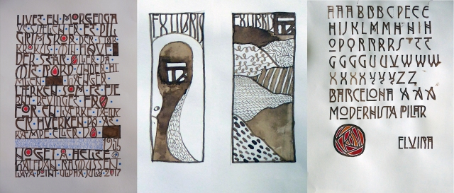
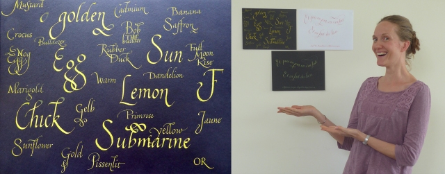
 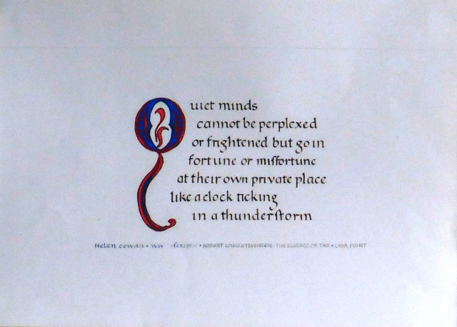 Lillian is going to include a source credit for her modern wolf–Laya Point, Ulpha, Duddon Valley…Ulpha, the place of the wolf. Please send me a photo when the colophon, &c. are added!
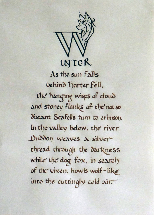
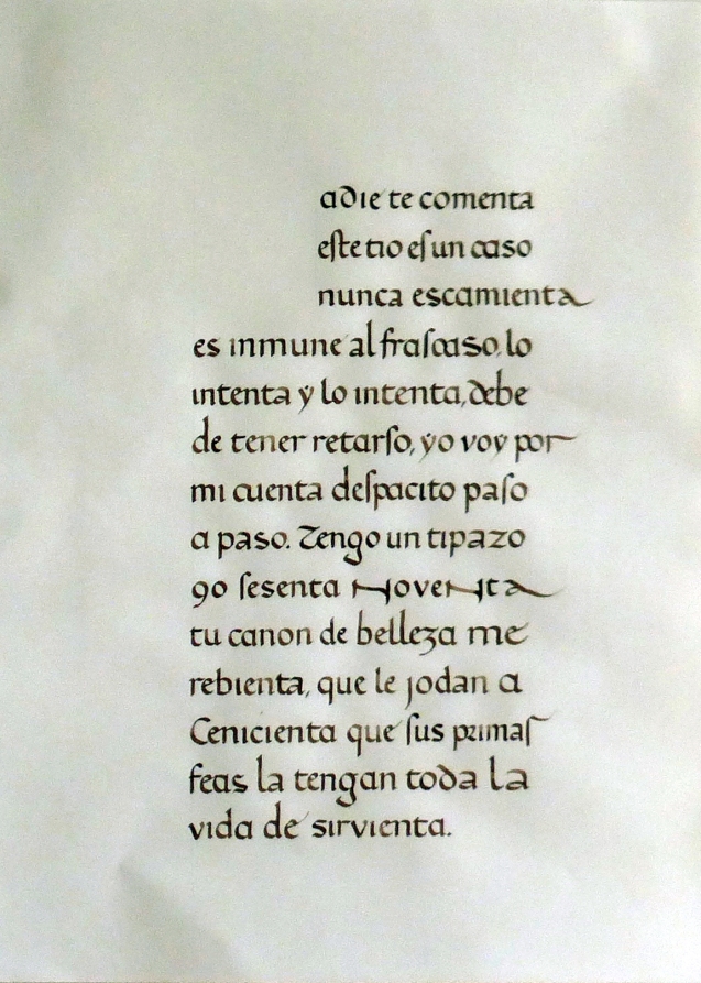
Miquel! With my apologies for earlier misattribution! Have you put the initial in? Please send me a better photo! (Obviously an idiotic lapse on my part as it’s the unique piece in Castilian!)
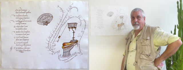
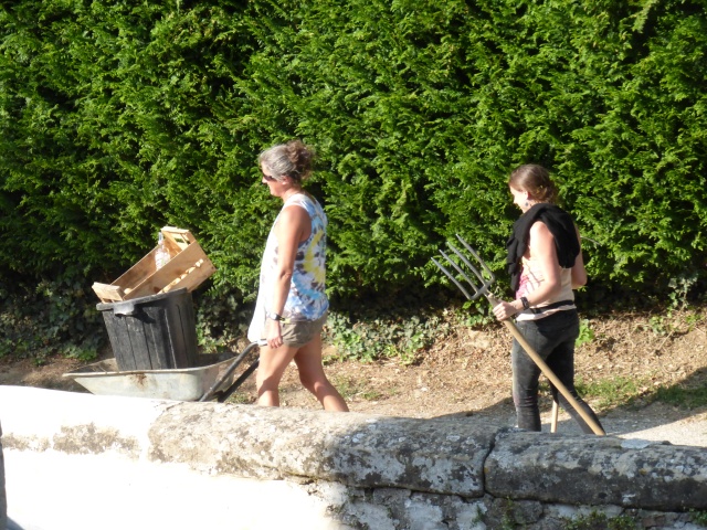
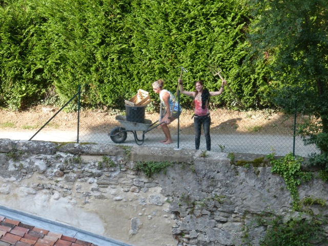
And Tom’s Ozymandias didn’t even make it into the exhibition. He never stopped working on it (between being our host and organizer among other jobs). Leafing through available books and materials in the classroom, he found some examples of white vine decoration, and immediately began teaching himself. So we gave him a supplementary exemplar, and a little advice, and he went for gold–unhistorical white vine using three tones of red instead of the traditional three or four colours; and not shell gold (what would that cost?) but “Iriodin”, an industrial “pigment” for metallic effects in textile printing. Mixed with gum arabic as a medium (or was it the duck-egg glair, Tom?) it made a nice non-traditional majuscule I for the text; with the colophon &c. curving up the margin… Excellent. I’m sure Lala (who, as our chef, was not available to sit in class for six hours a day) and Steffan (who had to look after the vegetables, the ducks, and run messages for the centre) will be returning to their pens, ink, drafts, &c. Perhaps you’ll send us some updates?
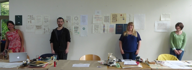
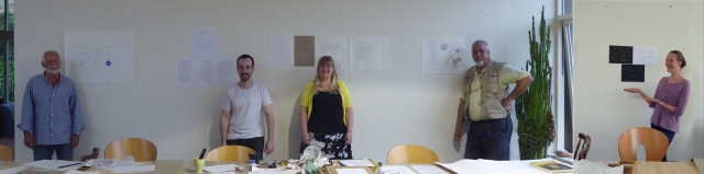
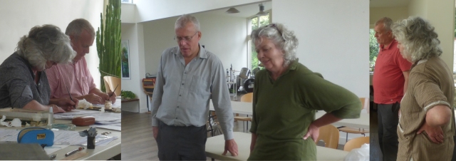
 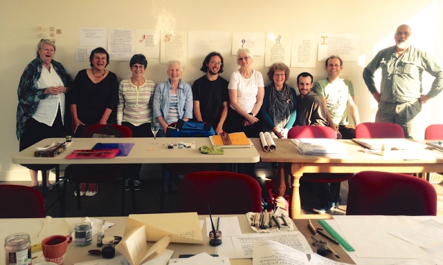 And at the end, me (Amanda) flanking Liz, Sue, Mabel, Stephen, Helen, Lillian, Miquel, & Tom, with Keith as the other bookend. (This photo, of course, is by Lala. We should’ve set up the tripod and got Steffen in, too. Next time.) Miquel, have I mis-attributed your projects, or were you hiding them? Send me photos, please! That’s the official end of the course. Before it began, however, Keith’s friend Ralph, the landlord? Landowner? Lord of the Smallholding? who is the father of Tom (who is co-incidentally Keith’s godson*–I mentioned this above, but you’ve had time to forget it) had asked Keith to do a wall (why does the word “mural” sound so pictorial?) at Laya Point. So while I began the re-consolidation of all our pens, paints, books, &c., to pack up; K finally attacked the interestingly piebald wall outside the door, in the porch, of the Old School building. And produced this:
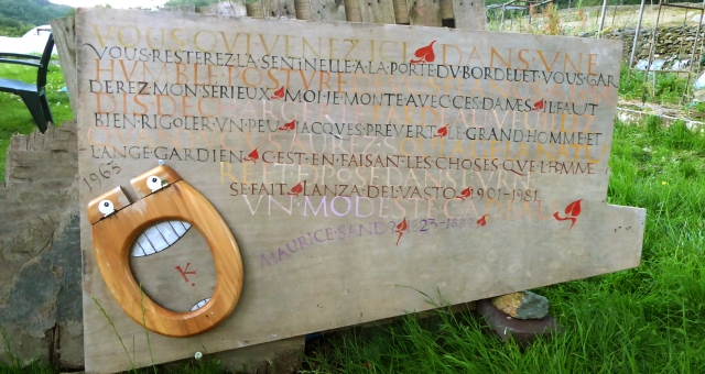
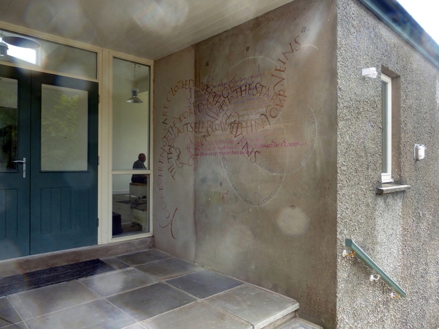
(Keith can be seen inside, decompressing with Tom and Lala.) What is it like full on?
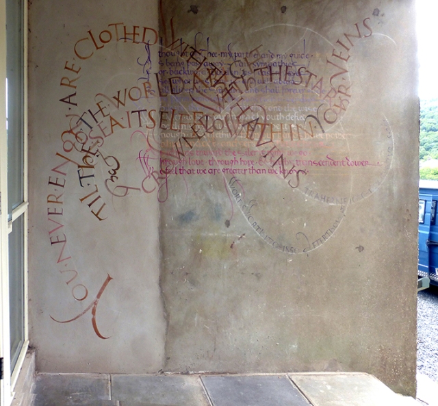
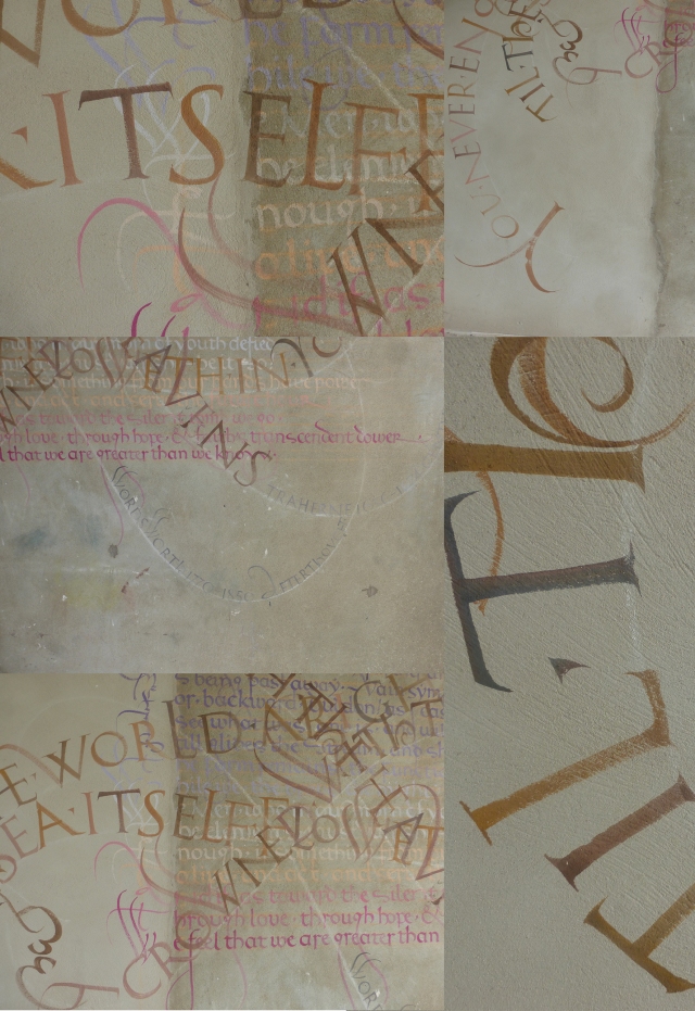
Some details, the unprepared render(?)/cement(?) surface with its weathering, stains and dings offers a depth even before letters are added. I believe Nicole has a photo of just the underpainting (Lala? send it along?) which looked rather bare before the swirling Romans came along to animate it. I am envious of Keith’s freely painted Roman majuscules…
& we look forward to seeing how it weathers in time, what patinas it gains; or whether it will fade or abrade and need palimpsesting (as one wall on fresh render did, in Paris).
Oops, I forgot “Jeeka” [Ma-gi-ca]…Mia you’ve seen before, disguised as a student… if only one or more of the ducks would waddle in and settle in the basket as well…what an idyll.
Mesdames & messieurs, meine Damen und Herren, ladies & gentlemen, I await your comments, corrections, addenda, and additional photos? Or links to your own online albums, blogs, &c. Please share! We didn’t have a “proper” evaluation–I believe Lala is sending a questionnaire. I look forward to the results.
Summer at Saint-Antoine 2015, Week 1, Italique, starts Monday evening. Will we have changed mental languages? Il faut s’échauffer.
*This is how we were lured to offer a course in England, where neither of us had taught for thirty years or more.
Have a look here at Laya Point’s own report on the course!
Have a look here at courses planned for Summer 2017!
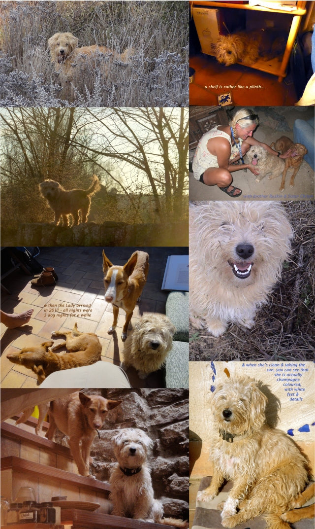
 This is the first photo I have (apparently) of Sandy. She came to us in May of 2006. I found her in the street with some wisps of straw, & full teats; so I assumed she had been dumped from a puppymill. Nobody was home but me – K & C2 were in Barcelona with a guest, buying C2’s flat. I couldn’t get anyone else in the village to take her on. So I took her in. Isn’t she lovely? Fortunately, Keith is the sort of husband who doesn’t mind – or even actively likes stray dogs.


 Miquel & Christa taking time out for relaxing on the wall – good for “calligraphers’ back”.
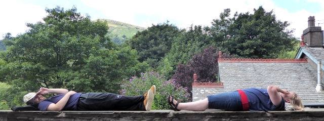
 Let’s have a closer look at some of those masterworks–Miquel’s warm walnut ink & green tones, flanking Christa’s gold & blue…
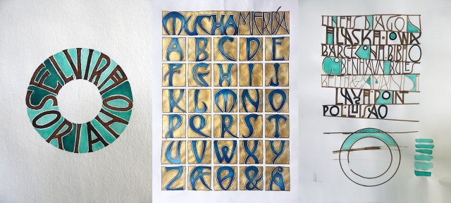
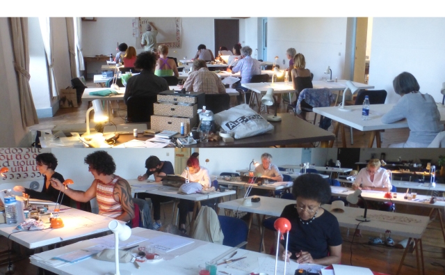
 As usual, there are people who really take advantage of every available moment on a calligraphy “retreat”. The lighting at Laya Point is amazing, and so is the enthusiasm!
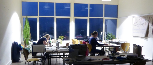 This summer’s chefs–led by Flora more than anyone–did an outstanding job of keeping us nourished in the scriptorium, with delicious vegetarian fare, often homegrown, harvested from the permaculture garden.
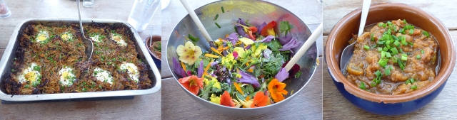

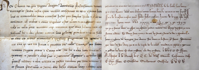
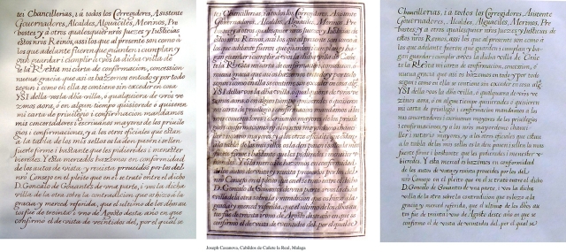 I think that’s Ingrid’s, Casanovas’s own (of course) & Miquel’s–please correct me if I’m wrong. The original document is from the annals of the village of Cañete la Real, Málaga.
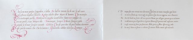


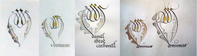
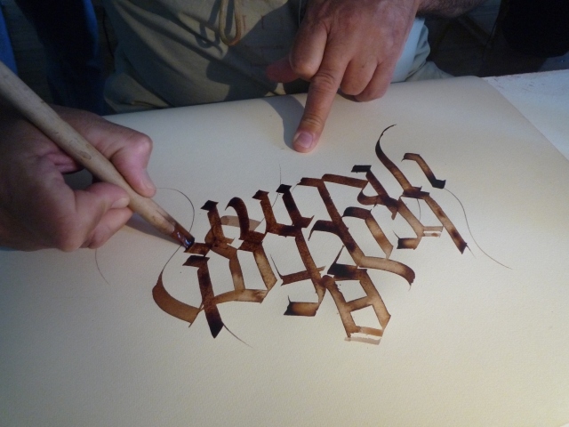
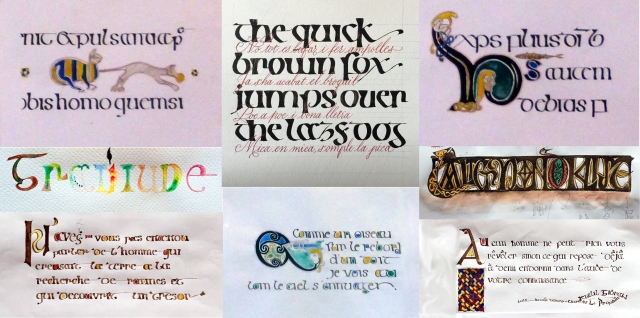
 & then at the right, Daniel working on his Fraktur project–because the third of the “Three Gothic Scripts” is Fraktur. Inundating his water-written letters with drops of spreading watercolour…
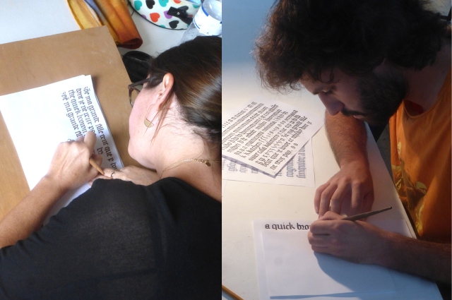


 Presenting the script, & the exercises, & the tools and materials…Sonia filmed the preparation of egg-yolk & glair; but I don’t think I dare embed a jocular 11+minute film in three or four languages with comedy interludes? It’s a bit slow. Here are the highlights:
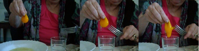


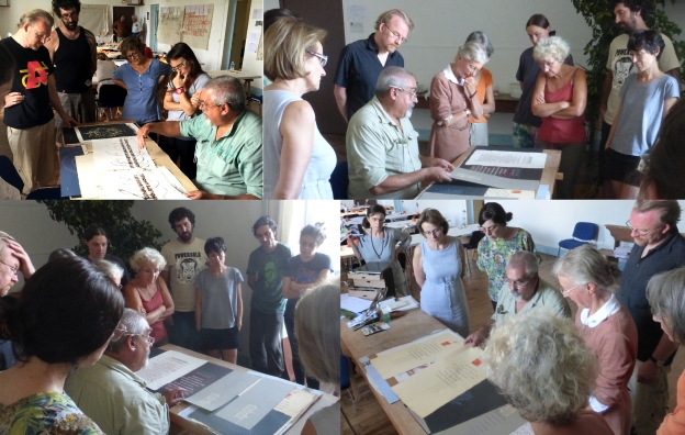
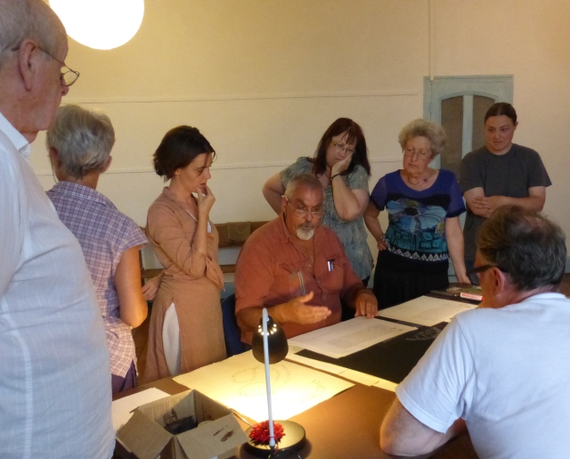
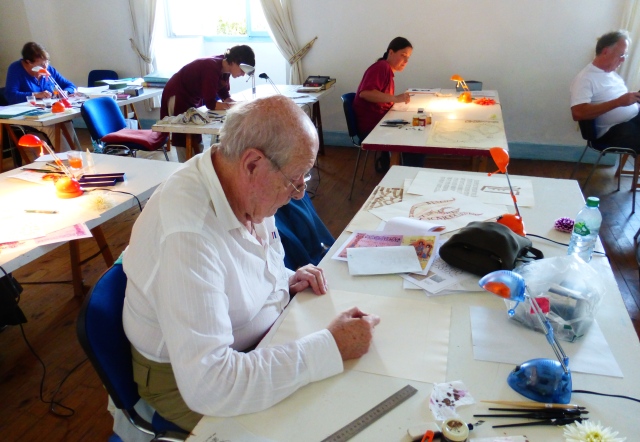
 Keith is quite capable of teaching celtic scripts, but I cannot think of a single exhibition piece he has done…he’ll remind me. So this class was left to my ministrations. Gathering in groups, examining everything we have managed to bring along…Keith showing his portfolio of unframed work and work-in-progress in the centre…
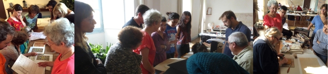

 The crowd at the end-of-course exhibition, almost blocking the show itself. & Maria’s “Thank-you”…

 This italic class quickly developed a personality–the wild mix of 8-9 français (depending how you count), three espagnols, three catalans, one allemande, a turque, an Englishman and a Dutchman…
 Presenting italic minuscules, simply…and in their place in the long, decorative Histoire de l’Écriture lecture (traces at right) which Keith gives once a year, open to everyone, not just the calligraphy students.
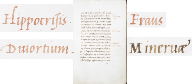 This summer’s class reached the limit of eighteen students (well, we are two teachers). Anne-Marie, Camille,
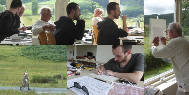
 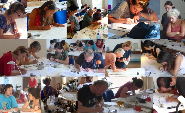 Petra came with a special interest in quill-cutting, but sadly no one got close enough with their cameras to show any detail. I shall get out a small tripod and do a photo-essay on quill cutting. Soon.


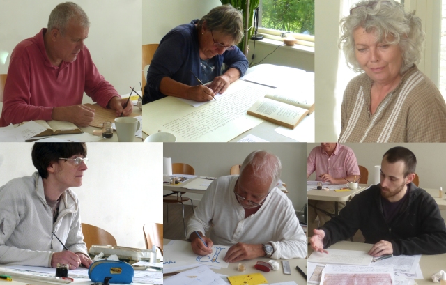
 Once you have your quill cut, or your “normal” metal pen echauffée & dipped in your brou de noix, it’s time for exercises. Most of these are Maria’s because while I was helping students, she was wisely and professionally taking photos. Possibly the only photos not ©Maria Montes 2015 (used by her kind permission Gràcies, Maria!) are those Maria is in. Which were taken by me…until or unless


 a few details–Maria: Laia: Maria: Laia:
 Here are, in the top row: Sonia & Ingrid (I think? please correct me if I’ve got it wrong!); middle row: Ingrid & Christiane; last row: Almila & Catherine:
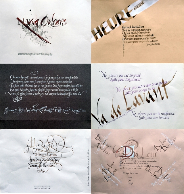

 And again, horizontal work; in the top row: David & Maria; in the centre row–is that Ingrid? & Albert; and in the last row Petra & Ingrid (thanks, Albert & Ingrid).
 Please correct my misattributions! My ageing memory is fading fast.


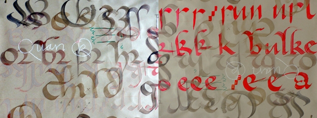
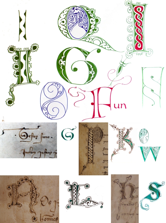
 Looking at some uncommon majuscule forms from manuscripts…
 Everyone hard at work,
 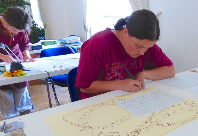 Magali…
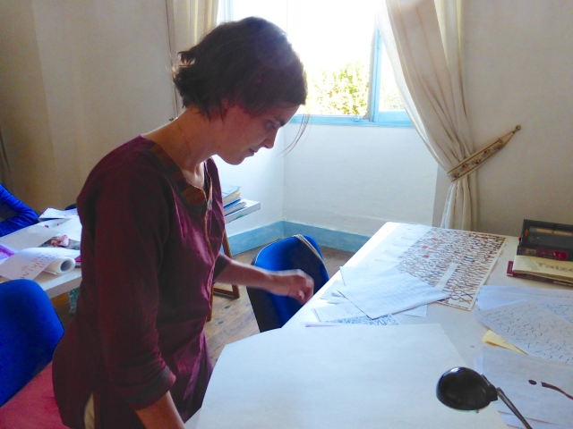 Françoise…
 David…


 Beautiful daughters, returning from a days work in the potato fields.
